9 Website Mistakes That Quietly Cost Studios Bookings
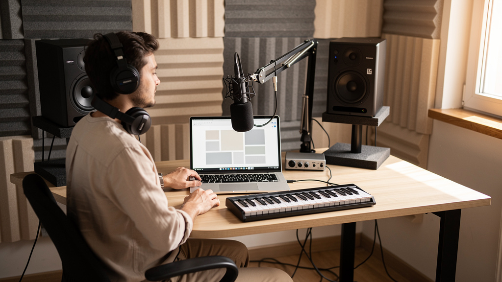
You know the feeling: the room sounds right, your work is solid, referrals say great things, and yet the website still produces too many ghost visitors and not enough paying sessions. People land on the site, poke around for a few seconds, then disappear. No inquiry. No booking. No second chance. For a lot of studios, the problem is not talent, gear, or even price. It is friction. Tiny points of doubt on a website for a recording studio can kill momentum before a prospect ever hears your reel.
The hard part is that most of these mistakes do not look dramatic. They are quiet. A vague headline. A missing rate range. A contact form that asks too much too soon. A portfolio buried under clever design. One or two of those issues can make a serious client think, “I’ll keep looking.”
Let’s walk through the website mistakes that cost studios bookings most often, and how to fix them without turning your site into a generic brochure.
Your homepage makes visitors work too hard
When someone lands on your homepage, they should understand three things almost immediately: what you do, who you do it for, and what to do next. A surprising number of studio sites miss at least one of those.
If your first screen is just a moody photo, a logo, and a line like “where creativity comes alive,” you are asking the visitor to decode your business. That is fine for an art installation. It is not fine for a service business.
A stronger opening is specific and grounded in the client’s job to be done. Think in terms of outcomes: vocal recording, podcast production, mixing, songwriting sessions, ADR, voiceover, content creation, or full band tracking. Then give them a next step that feels easy.
Your homepage should answer:
- What kind of studio or production service you offer
- Who typically hires you
- Where you are located or whether you work remotely
- How a client can inquire or book
That level of clarity is not boring. It is reassuring. Good studio website design reduces uncertainty, and uncertainty is what kills action.
Your best work is buried, weakly presented, or hard to trust
Prospects do not just want proof that you are talented. They want proof that you can handle their kind of project. If your portfolio is hidden in a menu, mixed with unrelated work, or presented with no context, it will underperform.
A reel is stronger when it is organized around the services people actually buy. Separate examples for podcast editing, vocal production, mixing, live band tracking, or post work tell a clearer story than one long montage. A short note on each sample helps even more: what the client needed, what you handled, and what the result was.
This matters because visitors are not only evaluating taste. They are evaluating fit, workflow, and reliability. If someone needs a clean audiobook chain and all they see is heavily processed indie rock, they may assume you are not the right room even if you could absolutely do the job.
You hide pricing so aggressively that people assume the worst
Not every studio should post exact rates for every possible service. But a total lack of pricing guidance creates anxiety. Many visitors will not inquire if they fear the answer will be wildly out of budget.
You do not need to flatten your business into a cheap menu. What you need is enough range and framing to qualify people.
Useful options include:
- Starting rates for common session types
- Half-day and full-day anchors
- Package examples for podcasts, singles, or voiceover
- A short note explaining what changes a quote
That approach filters out bad-fit leads while making good-fit leads more comfortable reaching out. It also saves you from spending time answering inquiries that were never realistic.
Your contact process asks for too much commitment
Some studios unintentionally treat first contact like a grant application. The form wants budget, timeline, session details, references, social links, project files, and a three-paragraph description before the visitor has built any trust. That is a conversion killer.
If someone is still deciding between three studios, your job is not to interrogate them. Your job is to make the first step easy.
A better inquiry flow usually follows this order:
- Ask for only the essentials: name, email, project type, and a short message.
- Offer a clear promise of what happens next and how fast you reply.
- For higher-intent leads, route them to a website with online booking so they can schedule a call or studio tour without back-and-forth.
If you want the process to do more of the heavy lifting, this is where a properly built done-for-you website for studios starts paying off. The right setup can pre-qualify leads, automate replies, and move serious prospects toward a call without creating friction for everyone else.
Your site looks polished but does not answer practical questions
Beautiful visuals matter. So does credibility. But most bookings are won or lost on practical confidence. Clients want to know what the session will feel like, what gear support exists, whether parking is a headache, whether remote revisions are possible, and whether you are organized.
Many studio owners underestimate how many bookings are lost simply because the site leaves too many operational questions unanswered.
At minimum, make these easy to find:
- Location and access details
- Core services and deliverables
- Session policies and turnaround expectations
- Basic equipment highlights where relevant
- Who the point of contact is
This is especially important for first-time clients, podcasters, small brands, and independent artists who have never booked a room professionally. Clear expectations lower stress, and lower stress improves conversion.
Your mobile experience is hurting more than you think
A lot of studio owners still review their websites on a desktop in the control room, while most new visitors first see them on a phone. If the site loads slowly, crops key images badly, buries buttons, or makes audio samples awkward to play, people leave.
This is not just about appearance. It is about momentum. If a prospect gets your link from Instagram, text, or a referral thread, they are often checking you out in a spare minute between other tasks. Mobile friction kills impulse inquiries.
Check your site on a real phone and look for:
- Fast load times on cellular data
- Clear buttons above the fold
- Readable text without pinching and zooming
- Playable portfolio samples
- Simple contact and booking actions
If your site feels annoying on mobile, it does not matter how good it looks on a 27-inch monitor.
You are not giving local clients enough trust signals
For studios that serve a city or region, local trust matters a lot. People want to know you are real, active, and easy to work with. This is where many owners miss straightforward wins for local SEO for studios without realizing it.
Your pages should naturally mention your location, nearby service area, and the kinds of clients you serve there. Client testimonials help more when they reference specific projects or local context. Original room photos beat generic stock imagery every time.
You do not need to cram city names into every sentence. You just need to remove ambiguity. A professional website for a creative business should feel grounded in a real place, with real people, doing real work.
You rely on one generic call to action everywhere
“Contact us” is not always wrong. It is just often too vague. Different visitors are at different stages. One person is ready to book. Another wants to hear work. Another wants to ask whether their podcast setup is a fit. Treating all of them the same lowers response.
Give people next steps that match their intent:
- Book a discovery call
- Request a session quote
- Hear recent work
- Check availability
- Ask about podcast production
That does two things. It improves conversions, and it tells you what the lead actually wants. If your site supports an appointment booking website flow or a CRM and sales funnel website setup, those paths can be tracked and followed up much more intelligently.
Your follow-up system is manual, slow, or inconsistent
Many studio owners think their website problem is traffic, when the bigger problem is what happens after the form is submitted. If a lead waits a day or two for a reply, the odds drop fast. They have already contacted someone else.
A simple fix is to map your inquiry path from first message to booked session. Write it down, then tighten every delay.
Use this audit process:
- Submit your own form and time how long it takes to get a confirmation.
- Read the auto-response and ask whether it sounds human, clear, and professional.
- Check where the lead information goes and who sees it first.
- Review how quickly you send the next step: scheduling, quote, or clarifying questions.
- Track how many inquiries stall because no one followed up twice.
This is where web design services for small business can create revenue beyond visuals. The best sites do not just sit there looking respectable. They route, tag, respond, and keep leads warm until a decision gets made.
How to fix the biggest booking leaks first
If your site has several of these issues, do not try to redesign everything in one weekend. Start with the fixes that reduce doubt fastest.
Prioritize in this order:
- Clarify your homepage message and main call to action.
- Make your portfolio easier to understand and more relevant to your services.
- Add practical booking information, including at least some pricing guidance.
- Simplify your inquiry form and improve response speed.
- Review mobile performance and tighten anything awkward.
Those five changes usually do more to get more studio bookings online than surface-level cosmetic tweaks.
And if you are at the point where patching things together is costing too much time, it may be smarter to hire a web designer for your studio who understands how creative-service businesses actually convert. AleXavior Web Services builds custom website design for small business owners in audio and production, with booking, CRM, and funnel logic built around how clients really buy.
A studio website should not just prove you exist. It should reduce doubt, answer the right questions, and make the next step feel obvious. When it does that, bookings stop feeling random.
Comments (0)
Leave a Comment
No comments yet. Be the first to comment!