Build a Studio Website That Books Clients While You Sleep
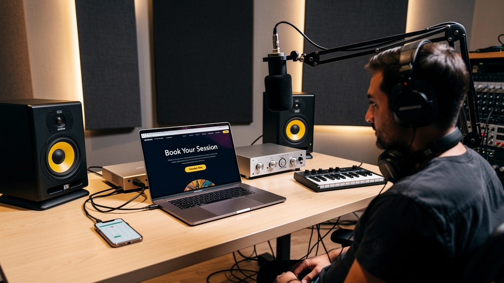
You know the feeling: someone says they found your studio online, loved your reel, meant to reach out, and then… nothing. Not because they hired someone better. Usually because your site made them work too hard at exactly the moment they were ready to buy. They had a song to finish, a podcast launch date, a voiceover deadline, a client breathing down their neck. If your website creates even a little friction, they bounce, hesitate, or promise themselves they’ll come back later. Most never do.
A studio website that actually books clients is not just a digital flyer. It is a signal chain. Traffic comes in, trust gets built, objections get handled, and the next step is obvious. When that chain is noisy, confusing, or misrouted, bookings disappear. When it is clean, simple, and intentional, your website starts working like your best assistant.
Your homepage has one job: move the right client forward
A lot of studio sites try to say everything at once: recording, mixing, mastering, podcast production, live tracking, rehearsal, coaching, gear rentals, content packages, and five different “contact us” buttons that all lead nowhere useful. That is the web equivalent of twenty plugins on a rough vocal before you have set the input gain.
The homepage should answer four questions fast:
- Who is this studio for?
- What kind of work do you do best?
- Why should someone trust you?
- What should they do next?
If a singer-songwriter lands on your site, they should immediately know whether you help artists finish release-ready songs or whether you are really built for podcast batch sessions and brand audio. If a local business needs voiceover or ad production, they should not have to dig through artist photos and studio jokes to find out you handle commercial work too.
Your headline should be concrete, not clever. “Recording, mixing, and production for artists and podcasters in Austin” beats vague branding every time. Good studio website design is less about decoration and more about reducing decision fatigue.
Don’t ask for contact if what they want is a booking
One of the biggest leaks on any website for a recording studio is forcing ready-to-buy visitors into a generic contact form. If someone wants to book time, “Name, email, message” is too loose. They have to figure out what to ask, what you need, whether you are available, and what happens next.
A better move is to create a real booking path with structure. Your website with online booking should guide people through the same questions you ask manually anyway.
- Pick the service: recording session, mix consultation, podcast recording, vocal tracking, production call.
- Choose a time or request availability.
- Answer a few qualifying questions: project type, timeline, number of songs or episodes, whether files are ready, and any special needs.
- Capture contact information.
- Trigger an automatic follow-up that confirms the request and explains the next step.
That one change filters poor-fit inquiries, speeds up good ones, and cuts the awkward email tennis that kills momentum. An appointment booking website should feel like an organized intake desk, not a suggestion box.
If you want this built properly, including automation after the form is submitted, it is often smarter to work with a done-for-you website partner for studios than patching together plugins and hoping they play nicely.
Use proof that answers buying questions, not proof that flatters your ego
Most testimonials are too thin to convert. “Great studio, awesome vibe” sounds nice but does not solve a prospect’s fear. People booking a studio are usually wondering some version of the same things: Will I sound better here? Will this process be easy? Will this person be reliable? Will my project actually get finished?
So your proof should answer those concerns directly. Strong trust elements include:
- Short testimonials that mention outcomes, communication, speed, comfort, or clarity
- Before-and-after clips or portfolio samples grouped by service type
- Photos of the room that show a clean, real working environment
- A simple process section explaining what happens from inquiry to final files
- Credits, client logos, or placements only if they are real and relevant
A producer looking for vocal recording does not care that you own expensive gear if they cannot tell whether sessions run smoothly. A podcaster cares less about your outboard chain than whether they can show up, record efficiently, and leave sounding polished.
This is where many studio owners miss the point of a professional website for a creative business. It is not there to impress other engineers. It is there to remove hesitation for paying clients.
Build pages around services, not just around your brand
If your whole site is Home, About, Gear, Contact, you are making prospects translate your business for themselves. Create dedicated service pages that match how people actually search and buy.
That might mean separate pages for recording, mixing, podcast production, vocal sessions, and studio rentals if those are distinct offers. Each page should cover who it is for, what is included, what problems it solves, what the workflow looks like, and the next step.
This matters for conversions and for visibility. Service pages give you more ways to show up when people search for a specific need, especially when paired with smart local SEO for studios. They also let you speak directly to different buyers without stuffing every message onto one page.
Good pages usually include:
- A clear opening statement of the service and ideal client
- Practical details on deliverables and session flow
- Common questions handled before they become objections
- Relevant work samples
- A strong call to action tied to booking or consultation
That is how you get more studio bookings online without making your homepage do all the heavy lifting.
Stop hiding your pricing logic
You do not always need to publish exact rates. But if your pricing is completely opaque, many qualified people will leave rather than ask. They are not always price-shopping. Often they are simply trying to figure out whether they are in the right ballpark before starting a conversation.
You can solve this without boxing yourself in. Give starting rates, package ranges, or a short explanation of how quotes are built. For example, you might explain that mixing varies by track count and editing needs, or that podcast sessions are priced by session length and post-production scope.
Even a little transparency builds trust. It tells visitors that you run a business, not a mystery. It also pre-qualifies budget mismatches before they fill your inbox.
The follow-up system matters as much as the design
A beautiful site that sends all inquiries into a black hole is just a prettier problem. The best-performing studio sites are connected to follow-up systems that keep warm leads moving.
At minimum, every inquiry should trigger an immediate response that does three things:
- Confirms the request was received
- Sets expectations for response time
- Gives the person one useful next step or piece of preparation
From there, stronger studios use a light-touch sequence for people who did not finish booking or who inquired but never committed. This is where a CRM and sales funnel website starts earning its keep. Not with gimmicks. With simple, sane automation that keeps good leads from going cold.
For example, if someone requests a mix consultation and does not book, a follow-up email two days later might answer common prep questions, share one relevant sample, and invite them to schedule. That is not pushy. It is helpful, and helpful converts.
Design for speed, clarity, and mobile behavior
A lot of studio owners review their own site on a large desktop monitor and forget that many inquiries happen on phones between tasks, commutes, rehearsals, or client meetings. If your mobile experience is clumsy, your conversion rate is already taking a hit.
Check these basics:
- Pages load quickly
- Buttons are easy to tap
- Forms are short and readable on mobile
- Audio samples do not hijack the page experience
- Your contact or booking action appears early, not only in the footer
This is where custom strategy beats generic templates. The right custom website design for small business should support how your buyers behave, not just how your brand looks in a mockup.
Treat your site like a booking workflow, not a brochure
If you want better results, audit the whole path as if you were a first-time client with a deadline. Can you tell what the studio offers in five seconds? Is there an obvious route to book? Are trust signals doing real work? Does the inquiry process feel organized? Does the follow-up continue the conversation?
When those pieces are aligned, your website starts functioning like a quiet, reliable system in the background. Fewer dead-end inquiries. Fewer vague “just checking rates” messages. More qualified conversations with people ready to move.
And if you are tired of trying to wire all of that together yourself, from messaging to booking flow to automations, it may be time to hire a web designer for your studio who understands both creative businesses and conversion. AleXavior Web Services builds studio sites with online booking, CRM, and follow-up systems baked in, so your website can do more than sit there and look good.
Comments (0)
Leave a Comment
No comments yet. Be the first to comment!