Studio Website Mistakes That Quietly Cost You Bookings
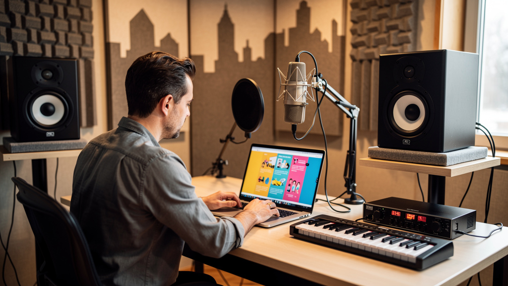
You know the feeling: someone says they “checked out your site,” sounded interested, then vanished. No call, no booking, no deposit. Meanwhile your work is solid, your room sounds good, and your rates are fair. That disconnect usually is not about your talent. It is about friction. Tiny bits of doubt, confusion, or missing information on your site can make a serious prospect back out before they ever reach out.
A website for a recording studio has one job beyond looking good: it needs to help a client trust you quickly enough to take the next step. If it makes them hunt for rates, guess what you actually do, or wonder whether you are still active, bookings leak out quietly. Here are the mistakes that do the most damage, and how to fix them.
Your homepage talks about you before it helps the client
A lot of studio sites open with something like “Welcome to our creative space” over a dramatic photo. It may look polished, but it does not answer the first questions running through a client’s head: What do you record? Who is this for? Where are you located? How do I book?
Visitors decide fast whether they are in the right place. Musicians, podcasters, and voiceover clients are not reading your homepage like a brochure. They are scanning for signs that you solve their specific problem.
Your top section should immediately communicate:
- what you offer
- who it is for
- where you are based or whether you work remotely
- the next action to take
A stronger opening is something like: “Recording, mixing, and podcast production in Nashville for independent artists and creators,” followed by a clear button to book a session or request a quote. Good studio website design starts with clarity, not mood.
There is no clear path to book
One of the biggest conversion killers is making people guess how to move forward. If your site only has a contact form buried on a separate page, you are adding unnecessary resistance. Every extra step gives a distracted prospect another chance to leave.
If you want to get more studio bookings online, the booking path needs to feel obvious and low-stress. That does not always mean posting full public pricing for every service, but it does mean giving people a simple way to take action.
A practical fix is to create one primary call to action and repeat it consistently across the site. Depending on how you work, that may be:
- book a consultation
- request studio availability
- start your project
- schedule a session
If your workflow supports it, a website with online booking can cut a lot of back-and-forth. Clients can see availability, choose a service, and submit details while their interest is still fresh. That is one reason many owners eventually bring in specialized web design support for studios and creative businesses instead of trying to patch together forms and calendar tools on their own.
Your service pages are too vague to sell anything
Many studio websites list broad terms like recording, mixing, mastering, production, editing, podcasting. The problem is that vague labels do not answer buying questions. A client wants to know what is actually included, what kind of project you are set up for, and whether you are a fit.
Each core service should have its own page or at least its own section with useful detail. For example, a podcast production page might explain whether you handle remote guest cleanup, episode editing, leveling, intro/outro assembly, and final deliverables. A vocal recording page might mention your booth, monitoring workflow, engineer support, and typical session types.
Think less like a gear list and more like a producer guiding a client through the process. Specificity reduces uncertainty, and uncertainty is what kills inquiries.
Your portfolio does not prove the kind of work you want more of
A playlist embedded at the bottom of a page is better than nothing, but it often does not help a buyer connect the dots. People need context. What was the project? What did you do? Who was it for? What outcome did the client get?
Your best samples should be organized around services and client types, not just dumped into one media block. If you want more podcast clients, feature podcast work prominently. If you want to attract singer-songwriters, show finished records in that lane.
Strong proof can include:
- before-and-after clips where appropriate
- short case studies
- client quotes tied to specific projects
- photos of real sessions
- credits with recognizable roles and deliverables
This matters because prospects are not only evaluating quality. They are checking whether you understand their world.
Slow, cluttered pages make your studio feel harder to work with
People read the smoothness of a site as a signal about the business behind it. If pages load slowly, mobile layouts break, or giant image sliders get in the way, it subtly suggests that working with you may be disorganized too.
This is where a lot of DIY sites get expensive. Owners spend hours polishing visuals but miss the basics that affect conversion: mobile responsiveness, readable page structure, compressed images, fast contact paths, and simple navigation.
A professional website for a creative business should feel effortless on a phone. That is where a big share of your visitors are coming from, often directly from Instagram, maps, or a referral text.
Check these areas first:
- Open your site on your phone and try to book yourself.
- Count how many taps it takes to find services, rates, location, and contact info.
- See whether buttons are obvious and forms are short enough to finish quickly.
- Remove any animation, pop-up, or oversized media element that slows down action.
If the path feels annoying to you, it feels worse to a first-time visitor.
Missing trust signals create quiet doubt
Most studio owners underestimate how much reassurance clients need before they send an inquiry. They are not only choosing a room. They are choosing whether to trust you with time, money, performance, and creative energy.
That means your site should answer the unspoken concerns:
- Are you active right now?
- Have real people hired you recently?
- Do you work professionally?
- Will I know what happens next?
- Are you local, reachable, and legitimate?
Testimonials help, but generic praise is weak. Specific testimonials are stronger: “We tracked a four-song EP in two days and left with edited stems by the next morning” tells a much fuller story than “Great studio!”
Other trust builders include a real photo of you or your room, a clear address or service area, response-time expectations, FAQs, and a short explanation of your booking process.
Poor local visibility means ready-to-buy clients never find you
Some studios obsess over social media and ignore the people searching for services nearby. That is a mistake. Local intent is strong. Someone searching “recording studio near me” or “podcast studio in [city]” is often much closer to booking than someone casually liking reels.
Local SEO for studios does not need to be complicated to make a difference. Your site should mention your city and service area naturally in key places, especially page titles, service copy, contact details, and metadata. Location-specific service pages can help when they are written for real humans, not stuffed with search phrases.
Just as important, your site needs consistent business information and pages built around how people actually search. If you offer an appointment booking website experience but nobody local can find it, the system is only doing half the job.
You collect inquiries, but you do not follow up well
This is where many studios lose money after the website technically “works.” A prospect submits a form, then waits. Or they get a vague confirmation and nothing else. By the time you reply, they have already messaged two other studios.
A good site should support a better sales process, not just a prettier front end. Even a small operation benefits from structured follow-up:
- Send an immediate confirmation that the inquiry was received.
- Set expectations for response time.
- Ask one or two smart qualifying questions if needed.
- Make it easy for the lead to book a call or session.
- Follow up automatically if they do not respond.
This is where a CRM and sales funnel website starts to matter. You do not need bloated corporate software. You need a clean system that stops leads from falling through cracks when you are in sessions, editing, or away from the desk.
Trying to say everything at once weakens the whole site
One common studio website mistake is cramming every service, genre, idea, and side offering onto the homepage. Recording, lessons, live sound, production, beat sales, rentals, photography, merch design, mixing, mastering, and podcasting all fighting for attention at once usually makes the business feel unfocused.
You do not have to hide services you offer. But your site should lead with the work you most want to book, then support it with clear secondary paths. If everything is equally loud, nothing stands out.
A simple structure works best:
- homepage focused on core offer and audience
- individual service pages for major revenue categories
- portfolio or case studies matched to those services
- about page that builds trust
- contact or booking page with one clear next step
That kind of structure is what turns a site from an online flyer into a tool that actually sells.
How to fix the site without rebuilding your whole business
You do not need to tear everything down at once. Start with the points where bookings are most likely leaking out.
Work through this in order:
- Rewrite your homepage headline so it clearly states what you do, who you help, and where.
- Add one primary call to action site-wide.
- Create or improve pages for your highest-value services.
- Replace generic testimonials with specific proof.
- Test the full inquiry process on mobile.
- Add follow-up automation or at least a strong auto-response.
- Tighten navigation so visitors can reach any important page in one or two taps.
If you do those seven things well, your site will already be ahead of a surprising number of studio websites.
And if you are at the point where the tech, structure, automation, and messaging need to work together, that is usually when it makes sense to hire a web designer for your studio rather than keep patching problems one by one. A solid done-for-you website or custom website design for small business can save a lot of lost revenue when it is built around actual studio buying behavior, not generic templates.
If you would rather have the whole system built properly, from studio website design to lead capture, booking flow, and follow-up, AleXavior offers done-for-you website systems for recording studios that are designed to help creative businesses win more of the inquiries they are already earning.
Comments (0)
Leave a Comment
No comments yet. Be the first to comment!