Website Mistakes That Quietly Cost Studios Bookings
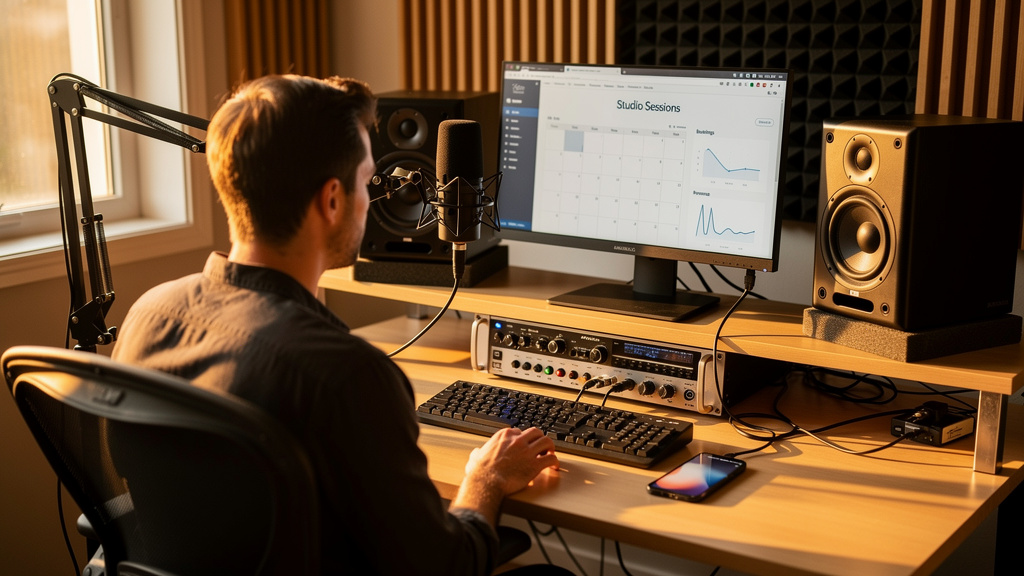
You know the feeling: the room sounds right, your work is solid, clients say they will send people your way, and yet the calendar has gaps that should not be there. A lot of studios assume the problem is traffic. Often it is not. The bigger problem is that the website is creating friction, doubt, or confusion right at the moment a potential client is deciding whether to reach out.
People do not book a studio website because it is pretty. They book because the site makes them feel, quickly and clearly, that this place fits their project, budget, and level of professionalism. If your website for a recording studio fails that test, you lose bookings long before anyone emails for rates.
Here are the mistakes that cost studios real work, and how to fix them without turning your site into a generic brochure.
Your homepage makes visitors work too hard
The most common problem in studio website design is not ugly visuals. It is ambiguity. A visitor lands on the homepage and cannot tell within five seconds what you do, who you serve, where you are, or what they should do next.
That is a booking killer because studio clients are not browsing casually. They are comparing options while juggling a session, a release deadline, or a podcast launch. If they have to hunt for basics, they leave.
Your homepage should answer four questions immediately:
- What kind of studio or service is this?
- Who is it for?
- Where are you located or do you work remotely?
- What is the next step: book, request a quote, or schedule a call?
A strong hero section might say that you record bands in Austin, mix podcasts remotely, or offer voiceover sessions with an engineer present. That level of clarity beats clever copy every time. Follow it with one primary call to action, not five equal buttons fighting each other.
If your site currently leads with a vague slogan and a moody photo, rewrite that section first. It is usually the fastest path to better inquiry quality.
You are hiding the information people need to say yes
Studios often hold back practical details because they want inquiries first. That sounds strategic, but it usually creates mistrust. Serious clients want enough information to qualify themselves before they contact you.
You do not have to publish every line item. You do need to reduce uncertainty.
At minimum, most studios should make these items easy to find:
- Core services
- Location and service area
- Session types or project types
- Gear highlights that matter to clients
- Rates, starting prices, or a clear pricing framework
- How booking works
- Turnaround expectations
Notice the phrase “gear highlights that matter.” A client deciding between studios probably does not need your entire patch list on the first visit. They do need to know whether you track drums well, offer isolation, have reliable vocal chains, or can handle live-off-the-floor sessions. Translate technical assets into creative outcomes.
If you want a benchmark, a professional website for a creative business should leave a first-time visitor thinking, “I know what this place does, what kind of projects belong here, and how to start.”
No clear path to book means fewer leads
A studio can lose bookings even with great traffic if the next step is fuzzy. “Contact us” is often too vague on its own. People hesitate when they do not know whether they are booking a paid session, requesting availability, or starting a conversation.
This is where an appointment booking website or a website with online booking can make a massive difference. Not every studio needs fully automated session checkout, but every studio does need a clean path into the sales process.
For most small studios, the booking flow should look like this:
- Visitor selects the service they want.
- They see a simple explanation of what happens next.
- They choose from one clear action: request a session, schedule a discovery call, or ask for a custom quote.
- You collect only the details needed to move the project forward.
- They receive a confirmation and know when you will respond.
That last step matters more than many owners realize. Silence after form submission creates anxiety. An automatic confirmation email and a basic intake sequence already put you ahead of a surprising number of studio sites.
If you want to get more studio bookings online, think less about “having a contact page” and more about building a friction-free handoff from curiosity to inquiry.
Your portfolio proves talent but not fit
Many studio websites make a subtle mistake: they showcase work, but they do not help a visitor imagine their own project succeeding there.
A grid of embedded tracks or pretty album art can be impressive, but it is not enough by itself. Context closes bookings. Tell people what the project was, what the client needed, and what role your studio played.
For example, instead of simply posting a song, add a short note: full-band tracking over two days, live drums in one room, edited vocals, mixed for streaming release. That tells the next band with a similar need that you have done their exact job before.
The same applies to podcast and voice clients. Show samples that match the kind of work you want more of. A cluttered portfolio that tries to speak to every market often weakens trust instead of building it.
Mobile experience is breaking trust
A lot of studio owners review their site on a desktop in the control room and assume that is enough. It is not. Many first visits happen on a phone between meetings, rehearsals, or commutes. If your site is slow, cramped, or hard to navigate on mobile, people read that as a warning about the business itself.
Watch for these common mobile problems:
- Buttons too small to tap comfortably
- Audio embeds pushing key information down the page
- Huge images slowing load times
- Contact forms with too many fields
- Rates and location buried in menus
You do not need a flashy rebuild to fix this. Often the win comes from simplifying layouts, reducing image weight, and bringing important details higher up the page. Good studio website design is less about decoration and more about making decisions easy.
You are missing local search signals
If your studio depends on regional work, weak local SEO for studios can quietly cost you every month. This is especially true for tracking rooms, rehearsal-adjacent spaces, podcast studios, and production houses that serve a city or metro area.
Search engines need clear location cues, and so do people. A visitor should not have to play detective to figure out whether you are nearby.
Make these updates:
- Use your city or service area naturally in page copy, page titles, and service descriptions.
- Create dedicated pages for major services rather than stuffing everything onto one page.
- Include your address or at least a clear service region.
- Add testimonials that mention real project types and locations when appropriate.
- Keep your business details consistent across your site and listings.
This is where many owners hit the limit of DIY. Good local structure, conversion-focused copy, and smart lead flow need to work together. If you are at that point, done-for-you website support for studios can be the difference between a site that merely exists and one that reliably produces qualified inquiries.
Your site is not following up after the first inquiry
Most studio sites treat the contact form like the finish line. It is really the start of the sales conversation. When someone reaches out, the speed and structure of your reply shape whether they book, stall, or disappear.
This is why a CRM and sales funnel website matters even for a small creative business. You do not need a bloated enterprise system. You do need a basic process that captures leads, tracks conversations, and follows up automatically when appropriate.
A simple post-inquiry system can include:
- Instant confirmation email
- Brief intake questions tailored to the service
- Calendar link for consultation calls if needed
- Reminder follow-up if the lead goes quiet
- Status tracking so inquiries do not get lost in your inbox
The point is not to sound corporate. The point is to stop depending on memory when sessions are busy and life gets noisy.
A studio website should not just display your work. It should carry part of the booking load when you are engineering, producing, editing, or simply off the clock.
Trying to speak to everyone makes the site weaker
Some studios are broad by nature, but broad does not have to mean vague. When the messaging tries to attract bands, podcasters, corporate voice talent, audiobook narrators, and music producers with the same generic language, nobody feels specifically understood.
The fix is not creating five different brands. It is structuring the site around clear services and audiences. Each service page should speak in the language of that client, answer their concerns, and show relevant proof.
That is one of the clearest marks of strong custom website design for small business: the site reflects how real buyers think, not how the owner mentally organizes the business.
How to fix the biggest problems first
If your site needs work, do not try to rebuild everything in one weekend. Start with the pages and decisions closest to revenue.
Use this order:
- Clarify the homepage message and main call to action.
- Make services, rates or pricing structure, and location easy to find.
- Simplify the inquiry or booking process.
- Add project-specific portfolio context and testimonials.
- Improve mobile layout and load speed.
- Set up automatic follow-up and lead tracking.
- Tighten local search signals across key pages.
That sequence works because it fixes trust, clarity, and conversion before polish.
If you are debating whether to keep patching your current site or hire a web designer for your studio, ask a simple question: is the website actively helping your calendar fill, or is it just sitting there describing the business? If it is the second one, the cost is not theoretical. It is lost sessions.
For studios that would rather stay focused on recording than wrestle with forms, automation, and conversion strategy, AleXavior Web Services builds studio websites that handle the booking side professionally. That kind of support makes sense when you want the site to act less like a flyer and more like part of the business.
Your room may be excellent. Your work may speak for itself once people get in the door. But online, the site is the door. If it feels uncertain, slow, or incomplete, clients hear that before they hear a single note.
Comments (0)
Leave a Comment
No comments yet. Be the first to comment!