Website Mistakes That Quietly Cost Studios Bookings
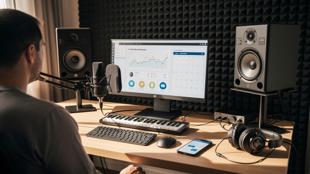
You know the feeling: the room sounds right, the gear is sorted, your work is strong, and still the calendar has weird gaps in it. You post clips, run referrals, maybe even get decent traffic to your site, but the inquiries stay thin or the wrong clients keep showing up. A lot of studios assume the problem is price, competition, or social reach. Often it is simpler than that. The website is creating friction at the exact moment a serious client is trying to decide whether to trust you.
For a recording business, a website is not just a brochure. It is part portfolio, part front desk, part sales call, and part scheduling assistant. If your website for a recording studio is vague, slow, outdated, or hard to act on, good prospects leave before they hear enough to say yes. The fix is rarely flashy. It is usually about clarity, trust, and removing tiny points of hesitation.
Your homepage is talking about you, not the client
One of the most common studio website design mistakes is opening with a generic statement about passion, creativity, or audio excellence. That copy may be true, but it does not answer the first question in a visitor’s mind: Can this place help me make the thing I need to make?
A singer-songwriter wants to know whether you can capture honest vocals without making the session feel clinical. A podcaster wants clean dialogue, easy scheduling, and a predictable workflow. A band wants to know if setup will be smooth and whether the room can handle drums. They are scanning fast.
Your homepage should quickly cover:
- Who you serve
- What you help them create
- What kind of sessions you offer
- Where you are located
- What the next step is
If a first-time visitor has to hunt for those basics, the page is doing extra work and winning less trust. Strong websites speak to the client’s project first, then back that up with your expertise, credits, room, and process.
No clear path to book means fewer studio bookings online
Studios lose real work when “contact us” is the only call to action. It sounds harmless, but it creates uncertainty. Contact for what? A quote? A tour? A discovery call? A paid booking? If the next step is fuzzy, people delay it.
This is where a website with online booking can change the business side of the studio. Not every client should be able to blindly reserve a full-day tracking lockout, but nearly every studio benefits from offering one or more structured next steps.
For most rooms, the booking flow should look more like this:
- Offer a primary action such as book a call, request a session, or check availability.
- Ask only for the information needed to qualify the lead: project type, preferred date, budget range, and contact details.
- Send an immediate confirmation so the client knows the request went through.
- Follow with a short automated email that explains your process, turnaround, policies, and what happens next.
That is why an appointment booking website outperforms a static contact page. It reduces ambiguity and makes your studio feel organized before the first reply is ever sent.
If you want that system built properly, not bolted together from plugins and guesswork, done-for-you website support for studios can save a lot of trial and error.
Your portfolio is impressive, but hard to trust
A playlist alone is not enough. Plenty of studio sites bury their best proof inside long pages, unnamed audio players, or scattered social embeds. Visitors do not just need to hear good work. They need context that helps them connect that work to their own project.
A stronger portfolio includes short framing around each sample:
- The type of client or genre
- What you handled: tracking, editing, mixing, vocal production, podcast cleanup
- Any useful production constraints, like remote recording or one-day turnaround
- A result the client cared about
This turns portfolio pieces into case evidence. It helps a prospect think, “They have done my kind of session before.” For a professional website for a creative business, relevance beats volume. Six focused examples with context will usually convert better than thirty random tracks with no explanation.
Rates are either hidden or dumped on the page with no framing
Pricing causes trouble at both extremes. Some studios hide every number, which invites low-fit inquiries and long back-and-forth email threads. Others post bare hourly rates with no explanation, which makes the decision feel like a commodity purchase.
You do not have to publish every detail, but you should frame pricing in a way that helps people self-select. Good options include starting rates, package ranges, half-day and full-day structures, or a short note explaining how projects are quoted.
What matters is that the visitor can answer two questions without sending an email:
- Am I roughly in the right budget zone?
- What am I actually paying for?
If your studio has premium instruments, a tuned live room, editing support, recall-ready sessions, fast file delivery, or engineering included, say so. Rate transparency without context can hurt. Context without any pricing can also hurt. The sweet spot is enough information to filter and reassure.
Local SEO for studios is missing the obvious signals
Many owners think search visibility is about blogging constantly. It is usually more basic. If someone searches for a recording or podcast studio in your city, your site should make your location and services unmistakable.
Local SEO for studios starts with clear page language, not hacks. Your site should naturally mention your city, service area, and session types in titles, headings, and body copy where relevant. You also need a dedicated contact page with full business details and a simple explanation of access, parking, or building entry if that is part of the client experience.
A custom website design for small business should also account for how people actually search. Many prospects are not searching for your brand name. They are searching for “vocal recording studio near me,” “podcast studio in [city],” or “mixing engineer for indie rock.” Your pages should match those intents without sounding forced.
If your site is beautiful but invisible to nearby clients, it is not pulling its weight.
The site feels old, slow, or unfinished
Audio people notice details. So do clients, even if they cannot name them. Tiny broken cues on a website read like larger operational problems in the studio. A cracked mobile layout, outdated copyright, missing images, or a form that looks suspicious can quietly kill trust.
Here is a practical review checklist to run this week:
- Open the site on your phone and try to book from scratch
- Check whether your best services are visible in the first screen or two
- Test every form and every main button
- Remove old offers, dead portfolio links, and outdated credits
- Compress oversized images so pages load quickly
- Make your phone number and inquiry path easy to find
None of this is glamorous, but it affects conversion. People equate digital polish with business reliability. That is especially true when they are about to trust you with a performance, a release, or a paid production deadline.
No follow-up system means leads go cold
A surprising number of studios answer inquiries manually from personal email, with no structure behind the scenes. That works until life gets busy, a session runs long, or three leads arrive at once. Then one sits unanswered for a day and books somewhere else.
A CRM and sales funnel website is not just for big agencies. For a small studio, it can be the difference between “we should be busier” and a steadier schedule. At minimum, your site should help you capture leads, tag what they need, and send consistent follow-up.
A simple follow-up sequence can do a lot:
- Immediate confirmation that the inquiry was received
- A second email with service details, portfolio links, and common questions
- A reminder if they have not replied after a short interval
- An easy path back to schedule a call or confirm dates
This is where smart web design services for small business start paying for themselves. The site stops being a passive page and starts acting like a reliable assistant.
The fix is not more hype. It is more clarity.
Studios rarely lose bookings because the font is wrong or the hero image is not cinematic enough. They lose bookings because the website leaves too many questions unanswered at the exact moment trust needs to rise. Who is this for? What happens next? Can I afford it? Have they done this before? Are they local? Will they reply?
If you want to get more studio bookings online, start by tightening those answers. Rewrite the homepage around client needs. Give visitors a clear booking path. Add context to your portfolio. Frame pricing. Clean up mobile usability. Build follow-up into the site instead of relying on memory.
And if you would rather hire a web designer for your studio than spend the next month piecing that system together, AleXavior Web Services builds studio websites that actually convert, with booking, CRM, and client flow built in from the start.
A good studio website does not brag louder. It makes the next step feel obvious and safe.
That is what turns traffic into real sessions.
Comments (0)
Leave a Comment
No comments yet. Be the first to comment!